

In December 2022, the FTC ordered Fortnite’s maker, Epic Games, to pay $520 million. Not for a data breach. Not for a hack. For interface design. $275 million of that was the largest penalty the FTC has ever obtained for violating a federal privacy rule, over default settings that left children’s voice and text chat open. The other $245 million, the largest refund the FTC has ever ordered in a gaming case, was for something more specific: button layouts and confirmation screens engineered so that players, including children, would make purchases they had not intended to make. Not tricked by a lie. Tricked by a layout.
That is a dark pattern. Not a bug. Not bad design. Design that works exactly as intended, aimed at an outcome the user never chose.
What the term actually names
A dark pattern is an interface built to produce a specific action (a purchase, a signup, a consent, a failure to cancel) that serves the company’s interest more than the user’s, by exploiting how people actually read screens under time pressure rather than how they’d choose if they slowed down and thought it through. The FTC’s own staff report, published in September 2022, names the common shapes: interfaces that bury the “decline” option in small gray text under a bright “accept” button. Checkout flows that add items or upsells you have to actively notice and remove. “Free trials” that silently convert to paid subscriptions, and cancellation flows requiring a phone call during specific business hours, when signup took one click at 2 a.m. Countdown timers claiming scarcity that resets the moment you refresh the page.
None of this requires deceiving anyone about a fact. It only requires knowing that most people do not read every line of a checkout page, and building the page around that.
The subscription trap, specifically
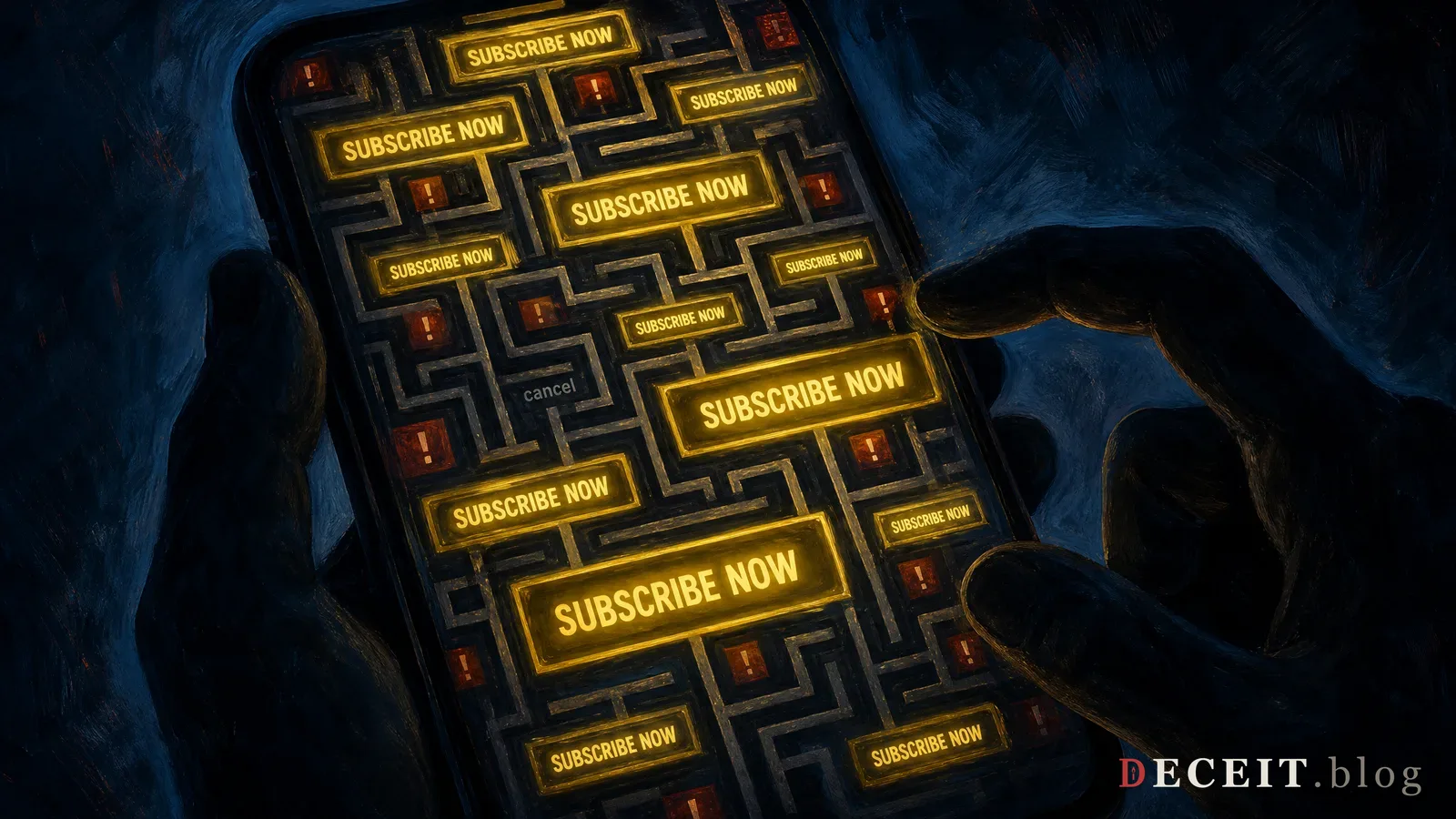
In October 2021, the FTC issued a policy statement putting the entire industry on notice that “negative option” subscription traps (free trials or low-cost intro offers that auto-renew into recurring charges, paired with a cancellation process deliberately harder than the signup process) would be treated as a law enforcement priority, not a UX debate. The imbalance is the whole mechanism: sign up in one tap, cancel through a multi-step maze, a phone tree, or a “please don’t go” retention gauntlet designed to outlast the customer’s patience.
Intuit found this out directly. In March 2022, the FTC sued the maker of TurboTax over a “free” filing ad campaign, alleging the company advertised free tax filing to the vast majority of users while designing the product so most of them would be routed into paid versions before they discovered they didn’t qualify for the free one, a bait offered to everyone, honored for a fraction of them, discovered only after the customer had already invested time entering their tax information.
New York’s Attorney General reached the same conclusion about a smaller player the same way. In 2022, online travel agency Fareportal agreed to pay $2.6 million and change its practices after the state alleged it used fake urgency (countdown timers, “X people are looking at this deal right now” banners, claims that prices would rise imminently) to pressure customers into faster, less-considered airline and hotel bookings.
Why this counts as the same machinery
The pattern underneath all of it is the same one that runs through every propaganda technique this project names: a claim or a choice is engineered to bypass the part of a person’s judgment that would object, if given time to operate. A countdown timer is choice foreclosure with a UI budget. A pre-checked box that donates your data to “partners” is consent manufactured by omission. A retention flow that makes cancellation cost more effort than the subscription is worth is compliance theater. The company can say a cancellation path exists, technically, while building it to fail.
None of this needs artificial intelligence to work, and dark patterns predate the current AI wave by well over a decade, designer Harry Brignull named and cataloged them starting in 2010, years before anyone was pitching an AI assistant. But AI chatbots configured to sound like a friend, a therapist, or a financial advisor, and then to nudge a purchase, a subscription, or a disclosure at the moment of maximum trust, are the same mechanism wearing a warmer voice. The button used to be the trick. Increasingly, the conversation is.
Verdict: This is not a debate about design taste. The FTC has put a dollar figure on it: $520 million from one company, in one case, for exactly this. The tell is simple and does not require a lawyer to spot, if canceling takes more steps, more time, or more friction than signing up did, that asymmetry was a decision, not an accident.